High-converting landing pages are single web pages built for one action, like booking a call or requesting a quote. For small business owners, that focus matters because a typical website design page often asks visitors to do too many things at once. When attention splits, conversions drop.
With Landing Pages, you guide one visitor group to one next step for lead generation. In this post, you’ll learn how to set a clear goal, shape the layout, write direct copy, add trust, and run simple tests that improve results over time.
Start with one clear goal and one clear audience
Before you choose colors or images, choose the conversion goal with a single clear goal. Pick one: a phone call, a form fill, a booking, or a purchase. Then match it to your target audience segment, not “everyone.” A homeowner asking for emergency repair needs a different promise than a price-shopping landlord.
Next, aim for message match. If your ad says “Same-day estimates,” your headline must repeat that outcome. This consistency lowers doubt because the visitor feels they landed in the right place, reinforcing your value proposition.
Also choose one offer (a lead magnet, consultation, or discount) that highlights your unique selling proposition and one primary call to action. If you need help aligning pages to outcomes, use this guide on building user-friendly website design around business goals.
Choose your offer, then remove everything that fights it
Cut anything that competes with your main action. Remove top menus, extra buttons, and unrelated links. Keep only what supports the decision, such as proof, brief details, and a single clear path to act.
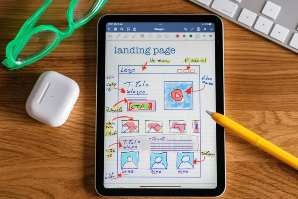
Build the page in a simple order that keeps attention
Use a top-to-bottom structure that follows the Z-pattern or F-pattern to create visual hierarchy and reads like a short argument. Leverage solid UI/UX design by starting with a headline that states the outcome. Follow with a subhead that names who it’s for. Add a hero image or product shot that matches the offer. Then use a small set of benefit bullets:
- Reduce time or cost
- Explain the result you deliver
- Clarify what’s included
- Set a simple expectation for timing
After that, add social proof, explain what happens next, and repeat the CTA near the bottom. Keep the page scannable with white space, readable font size, and mobile-first spacing.
An example of a clean landing page design with one main message and CTA, created with AI.
If your visitor can’t explain your offer in five seconds, your page is doing too much.
Write copy that sounds like your customer, not a brochure
Use simple words and concrete outcomes to enhance user experience. Address one main objection, such as price, time, or risk. Keep sentences short, because people skim.
Weak headline: “Quality services for all your needs.”
Improved headline: “Get a same-day roof inspection and a written estimate.”
That second line tells them what happens, and when.
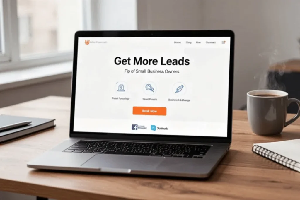
Add trust signals and reduce friction before you ask for action
Trust is part website design and part evidence. Add social proof through customer testimonials, review scores, client logos, before-after results, and a clear guarantee when you can support it. Include a short privacy note near your form so people know you won’t spam them.
Then reduce friction. Short forms win, clear error messages help, autofill saves time, and an FAQ section answers common questions. For checkout pages, keep it one step when possible. Accessibility also supports trust, so use strong contrast, label fields clearly, and ensure mobile-friendly layouts. Finally, page speed matters, because slow pages feel unreliable. These principles boost ecommerce landing pages and SaaS landing pages alike. For practical ideas, review small changes that can lift conversions.
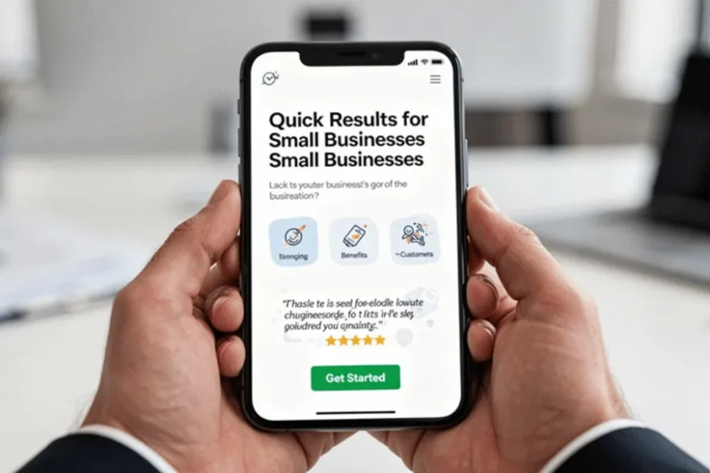
A mobile-first landing page view with clear spacing and an easy-to-tap CTA, created with AI.
Forms and buttons that people actually finish
Ask for the minimum fields you truly need. Label each field clearly, and stick to one primary button color. Use action text like “Book my review,” not “Submit.” Under the button, add one reassurance line, such as “No obligation, you’ll get a reply within 1 business day.”
Measure what matters, then improve one thing at a time
Watch a few metrics: conversion rates, cost per lead, scroll depth, and form starts versus completes. Those signals show where attention drops. Start with landing page templates for a solid foundation, then run simple A/B testing on one variable at a time, such as the headline, CTA text, or hero image. Use a landing page builder to make these changes easy. Give each test enough traffic to be fair. Small, steady changes beat constant redesigns.
Conclusion
Good landing page design is simple by intent: one goal, a clear structure built on strong UI/UX design, real trust through social proof, and careful testing. Incorporate professional photography to boost visual quality, and add a sticky bar to keep your CTA visible throughout the visitor’s journey. When you treat the page like a focused argument in your digital marketing campaign, your visitor knows what to do next.
If you want expert feedback on your Landing Pages, schedule a free website review here: https://calendly.com/mdrobes.